top of page


Microsoft Edge

TIMELINE
INTRODUCTION
As part of the Edge Design team at Microsoft, helped build the most productive and trusted browser in the world.
Apr 2020 - Mar 2022
TEAM SIZE
1 PM, 1-2 devs and 1 designer per functional area.
MY ROLE
My area of focus was the autofill, passwords, and payments experience across Edge. I have also played a role in helping improve the experience of developers submitting extensions to the Edge addons store.
I had also volunteered to be the Accessibility champ of the team and had helped reduce acc related bugs.
RESPONSIBILITIES
Autofill, passwords and payments
-
Improving the overall Autofill experience across Edge, with a focus on making it easier and secure for the user.
-
Working on all experiences related to passwords saved to Edge, helping push Edge to become the most trusted browser.
-
Various payment scenarios with a focus on helping users make payments confidently and seamlessly on the browser.
Extensions
-
Helping improve the experience of submitting extensions for Edge, thereby increasing the number of extensions submitted to the Edge addons store.
Accessibility champ
-
Volunteered to take on the acc champ role within the design team.
-
Help reduce the number of bugs raised around accessibility issues.
-
Guide and help new joiners on creating detailed acc design specs.
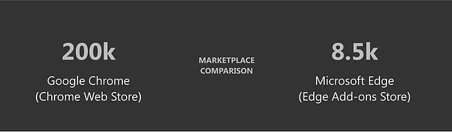
Improving the developer experience for submitting extensions for Microsoft Edge
With a goal to increase the number of extensions submitted to Microsoft Edge, I have lead the design effort to improve the extension submission experience for developers, who intend to make their extensions available on Edge Add-ons store.

STAGE ONE: UNDERSTAND

EXTENSIONS STUDY
Analyzing Top Chrome Extensions
As part of my research to better understand the domain and what makes extensions successful, I did a study of the top 10 extensions in 5 categories on Chrome Web Store.
The categories were as follows:
1 - Top 10 of Editor’s Picks
2 - Top 10 of Entertainment
3 - Top 10 of Staying at Home
4 - Top 10 of Online Education
5 - Top 10 of Accessibility


EXTENSIONS STUDY
Summary of extensions study
-
25 of the extensions used basic screenshots while the rest used well designed banners or detailed screenshots. Well designed banners generally looked like promotional banners while detailed screenshots explained the features of the extension along with a spotlight highlighting the extension.
-
6 extensions explicitly mentioned that they would run offline as well.
-
Most of the extensions seemed to have good or average logos (in terms of resolution) with just Zoom Scheduler extension being an exception.
-
In terms of size of extension, the sizes ranged from 13.76 KB (Citations) to 79.82 MB (Emoji Keyboard by JoyPixels)
-
Only 15 out of 50 extensions used videos as part of the screenshots.
-
Video length ranged from 00:19 to 4:49 with average length being 1:21.
-
24 of them had their extensions available only in the English language. Maximum number of languages an extension was made available for was 54 languages.
-
26 extensions used annotations on their screenshots.
-
17 extensions used spotlight or other graphical elements in their screenshots to highlight features of the extension.
-
Most of the extensions were free (44 extensions) but 6 of them offered in-app purchases. The cost per item ranged from ₹60.00 - ₹609.00 per item.
Another observation made while doing this study on the Chrome Web Store was that, although there is a filter panel to the left, there is no way to sort the list of extensions in the categories itself. For instance, while setting the filter to see only 5 star rated extensions, I could not further sort it based on number of reviews. So there were a lot of extensions that had only 1 or 2 reviewers that were also showing up. Maybe we could consider this for our own store?
COMPETE STUDY
Exploring best practices across platforms
-
Went through various E-commerce sites for sellers and also developer sites like Amazon, Flipkart, Etsy, Atlassian, Firefox for developers, Teams for developers, Chrome developers, etc.
-
How are they enticing their sellers and developers?
-
Hierarchy of information
-
What are the help links for the devs?
-
How is it helping the user making a decision to go forward?


CURRENT CHALLENGES
Identifying issues with the landing page for developers
-
Nothing enticing - What are the benefits? Why Edge?
-
No information about the registration and publishing process.
-
The illustrations don’t portray anything, looks very generic.
-
No data about number of user base or developers
-
No visual or design parity with existing Microsoft product sites
CURRENT CHALLENGES
Analysis of the existing workflow of submitting extensions
-
Absence of hand-holding
-
Poor navigation
-
Cognitive load
-
Misleading
-
Clutter
-
Lack parity with chrome
-
No guides or developer help links
-
No link to the documentation page
-
Cannot see all the status of the extensions from the dashboard


Apart from analysing existing implementation of the platform and identify usability issues, I also reached out to developers to understand more about their workflows and challenges through interviews.
As-is journey map
-
In order to visualise the developer's user flow and highlighting challenges at each stage of the process, it was important to create an as -is journey map.
-
This also acted as a great communication tool with other stakeholders.


STAGE TWO: DEFINE

DEFINING THE PROBLEM
Analysis of the existing workflow of submitting extensions
-
Absence of hand-holding
-
Poor navigation
-
Cognitive load
-
Misleading
-
Clutter
-
Lack parity with chrome
-
No guides or developer help links
-
No link to the documentation page
-
Cannot see all the status of the extensions from the dashboard

The problem was broadly delineated into three distinct categories: pre-submission, submission, and post-submission phases. Design deliverables were crafted in alignment with these categories. Furthermore, the design principles emerged from a deep comprehension of user pain points and areas of opportunity.
STAGE THREE: IDEATE

SETTING THE FOUNDATION
Identifying the basic sections and hierarchy of information required to solve the identified pain points
-
Process: (easy process of joining and submitting)
-
People: (who can submit extensions etc.)
-
Support: support/features (help support availability, documentation etc. that makes it easier for developers to submit extension)
-
Stories: (developer testimonials to help build confidence)


CASE STUDY
Mahalo vs Quora
-
Mahalo.com was a Q&A site that utilized a special incentive process to get users to ask and answer questions.
-
Whoever submits a question also offered a bounty in the form of a virtual currency, ‘Mahalo Dollars’ for the best response.
-
The ‘Mahalo Dollars’ could then be exchanged for real money.
-
The motivation behind this structure was to drive user engagement.
-
But over time, users began to lose interest.
-
Around that same time, Quora began to boom.
-
Unlike Mahalo, Quora did not offer a single cent to anyone answering questions.
-
Why was Quora’s engagement growing while Mahalo’s was shrinking, despite having a monetary reward?
-
The answer: an incomplete understanding of their user’s drives.
-
On Mahalo, monetary rewards were so rare to occur that it wasn’t impactful. So those who were driven by money were better off working at their hourly jobs then answering questions.
-
On the other hand, Quora demonstrated that social rewards and the variable reinforcement of recognition from peers proved to be much more FREQUENT and salient motivator.
STAGE FOUR: PROTOTYPE


Informative sections that answer all the questions a developer would have.
Testimonials from other developers in order to build trust.


Helping the developer at every stage of submitting an extension.
A developer needn’t worry too much about writing a good description or editing images.


Introduced “Installs:Impressions” ratio for quick and easier understanding.

Letting the developer know when something seems to be going wrong and suggesting a solution for it.
Giving the developer a good understanding of how the extension is doing in that particular category.

STAGE FIVE: TEST

TEST
Flash feedback sessions
-
Cognitive walkthroughs using clickable prototypes.
-
6 particpants.
-
A detailed summary is created towards the end of the session alongwith video recordings.
-
Identified issues are then prioritized and worked on.
TEST
Product Huddle (Review)
-
Once the mocks are ready and validated, they are presented to the Leadership Team for a final review.
-
The members of the huddle include PM Leads, Engg. Leads, Design Leads, Partner Director etc.

STAGE SIX: DEVELOP

READY FOR IMPLEMENTATION
Achieving development efficiency and UX consistency through Fluent design system
With a robust design system already implemented, the final step was to verify that our designs seamlessly integrated with the appropriate components from the system. This not only streamlines the development process but also safeguards against deviations from established standards, thereby upholding UX consistency across all our products.
READY FOR IMPLEMENTATION
Craftsmanship review and staging of designs
-
Once the designs are implemented, a panel of designers get together to compare the implementation with the Figma mocks to make sure they are aligned.
-
Any craftsmanship issues are filed as bugs and tracked by the respective dev + designer.
-
As part of the development effort, we followed an approach of implementing in stages, in order to minimise dev effort as well as not come across as a sudden drastic change to the user.
-
Decisions taken during staging were taken by trying to balance User Value and Dev Effort.


Future thinking
-
Automate taking screenshots, writing descriptions etc.
-
A community for developers that allows them to interact with consumers directly.
-
Having an option for users to submit the extension that they want and devs could work on them.
-
Online sessions and meet-ups for devs in the community to grow and improve on their skills.
bottom of page